Base Dozen Forum

Would you like to react to this message? Create an account in a few clicks or log in to continue.
Base Dozen Forum

A board for discussion of the number twelve as the base of numeration in mathematics and physics.


Download the Base Dozen Forum as a mobile device app and subscribe to push notifications.

Dozenal Clock

Dozenal Clock
Local Dozenal Time:   
Local Decimal Time:   

Latest topics

» Phonetic Dozenal Number Names
Colour Classification EmptyMon Apr 15, 2024 12:08 am by Phaethon

» Dozenal Number Words from Metric Prefixes
Colour Classification EmptySat Apr 13, 2024 3:38 pm by Phaethon

» Dozenalizing Metric
Colour Classification EmptyFri Apr 05, 2024 12:23 pm by Phaethon

» Myon Dozenal Nomenclature
Colour Classification EmptySat Feb 17, 2024 3:18 pm by Phaethon

» Information per Area of Numerical Forms
Colour Classification EmptyMon Jan 29, 2024 10:50 am by Phaethon

» Denominational Dozenal Numerals
Colour Classification EmptySun Jan 28, 2024 9:25 pm by Phaethon

» Proto-Indo-European Numbers
Colour Classification EmptyFri Jan 12, 2024 4:25 pm by Phaethon

» Radix Economy for Alternating Bases
Colour Classification EmptySun Dec 24, 2023 5:41 pm by Phaethon

» Graduation Subdivisions
Colour Classification EmptySat Dec 02, 2023 12:58 pm by Phaethon

RSS feeds


Yahoo! 
MSN 
AOL 
Netvibes 
Bloglines 

Top posters


  • Reply to topic

Colour Classification

Phaethon
Phaethon
Admin


Posts : 166
Points : 267
Join date : 2019-08-05

Colour Classification Empty Colour Classification

Post by Phaethon Fri Sep 09, 2022 1:40 am

Introduction: Motivation in Connection with Dozenism
One application for base twelve where a division by three is thought to be convenient is in the classification of colour hues with reference to the three pigments of trichromatism. A representation of all the possible hues can be depicted in a planar cross-section through a three-dimensional space in which all colours can be plotted, for example by using as co-ordinates the amounts of three primary colours, most typically Red (R), Green (G), and Blue (B), forming the RGB colour space model used in description of colours produced by light-emitting diodes or phosphors in display screens of electrical devices. In the planar slice containing the hues, the three primary hues can be made to divide the full angle into three equal angles. For specifying these thirds of a unitarily or otherwise normalised full angle of turn conveniently by numerical fractions, a base containing the number three as a factor would be advantageous.

The Need for an Alternative System of Classification
Some have objected to the proposal of a Red-Green-Blue (RGB) co-ordinate system as a basis for naming colours because it is alleged to be not very intuitive in the connection between the colours produced and the rectangular co-ordinates and vice versa. However, it is possible to interconvert between different types of co-ordinate systems in three dimensions, such that other degrees of freedom for specifying colours can be used. For example, rectangular co-ordinates can be replaced by either cylindrical or spherical co-ordinates in a precise manner according to mathematical formulae. Variations on a cylindrical co-ordinate system theme for specification of colour include the so-called Hue-Saturation-Lightness (HSL) and Hue-Saturation-Value (HSV) classificatory systems. I disapprove of those systems in which all the fully saturated hues are in the same plane instead of being raised or lowered out of the plane by lightness or luma. The way in which the so-called Hue-Saturation-Lightness (HSL) model uses "lightness" is perceptually incorrect. I would prefer a spherical notation because of the globular shape of the visible gamut in accordance with personal experience and experimental elucidation such as by the Munsell system or by the International Commission on Illumination (CIE). A spherical co-ordinate system could impart the balanced advantages of greater conformance to perceptual regularity and a smaller proportion of unused or impossible colours in the space of the system according to the domains of available values for the co-ordinates.

Criticism of the Munsell System
The decimal steps in the Munsell system are abhorrent and could be transformed to dozenal increments. The Munsell so-called "Value" co-ordinate could be normalised to a range of zero to one, which could then be divided dozenally by simply writing the decimal numbers in dozenal format. The use of five principal hues in the Munsell system is an unnecessary complication, since all hue qualities can be specified by combinations of three hues in trichromatic vision, provided that the three primaries are chosen such that a neutral hueless grey or white devoid of chroma is circumscribed by them and that none of the primaries are complementary to each other. Additional primary hues can increase the gamut only in the sense of the extent of saturation. Another system of colour classification, the Pantone system, suffers from this defect of containing too many base colours. A further problem with the Munsell system is that it places too much emphasis on equal perceptual increments between the colours separated by the same numerical distance along its particular co-ordinates without taking into account physical characteristics that are objectively measurable experimentally using instruments rather than overreliance on perceptions of variable human observers. The ability of humans to discriminate colours at different wavelengths or hues varies from one individual to another depending on genetic differences between the colour receptors. Looking at the Munsell swatches, I see colours dumped into the same level that do not seem to have the same lightness and the variation along other dimensions does not always look consistent. I would say that better consistency is observable in models based on the colour cube of Red-Green-Blue (RGB). Basically, the Munsell system does not conform exactly regularly to how a human conceives of colour properties. It is inaccurate, though roughly approaching how colours should be classified in terms of their conceptual attributes. This is a reason for why the Munsell system is superseded in technological applications such as electronics by variants of systems devised in conjunction with the International Commission on Illumination (CIE), where the hues have been matched to wavelengths and lightness or luminance to some function of spectral radiance.

Criticism of the CIE systems
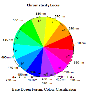
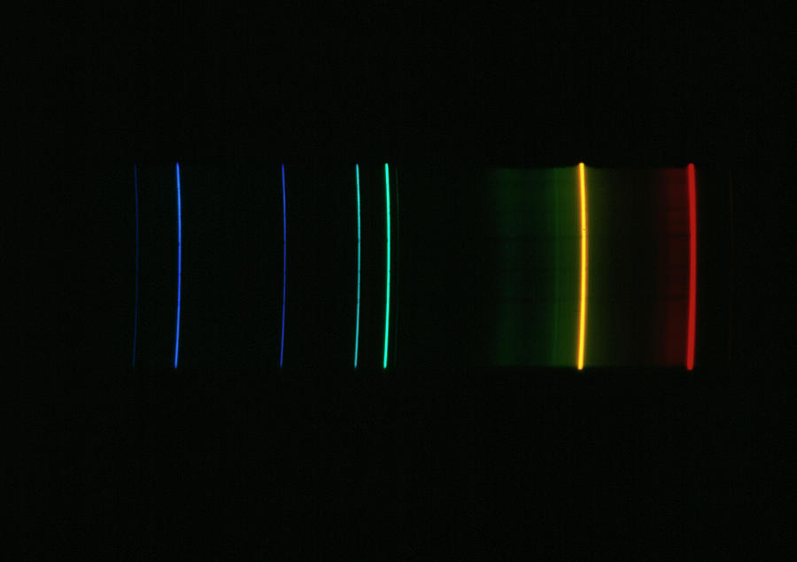
The experimental method from which the systems approved by the International Commission on Illumination (CIE) are derived involved somewhat arbitrary selection of hues at the particular wavelengths of 700 nanometres for "red", 546 nanometres for "green" and 436 nanometres for "blue", which are then called "standardised". It does not really matter exactly which wavelengths are used for the definition of the consequent space of colour hues, as long as the extreme ones are sufficiently far apart to cover the whole visible spectrum. Next, emissions at these wavelengths were combined to match the hues of monochromatic wavelengths. The results for the amounts of "red", "green", and "blue" as functions \(\bar{r}(\lambda), \bar{g}(\lambda), \bar{b}(\lambda)\) of the monochromatic wavelengths \(\lambda\) were then transformed to another rectangular co-ordinate system \(\bar{x}(\lambda), \bar{y}(\lambda), \bar{z}(\lambda)\) to avoid negative numbers and also in such a way that the middle function \(\bar{y}(\lambda)\), which has a peak at about 555 nanometres, would be the same as the photopic lightness or luminance. Perhaps with the realisation of there being a wavelength associated with a maximum of illuminance it would have been simpler to have used a monochromatic emitter with that wavelength as its peak for the middle primary hue. I interpret these functions as absorption spectra for wavelengths by hypothetical receptors which are not real. Any colour is then specified by a further set of rectangular co-ordinates \(X, Y, Z,\) called "tristimulus" values, which express how much that colour excites the respective hypothetical and unreal receptors. Actually, in my interpretation these co-ordinates are not really three separate stimuli, but represent combinations of stimuli. Thus for example, the luminance co-ordinate should be the result of a sum from a combination of excitation of all three receptors. For the expression of the colour space by chromaticity and luminance forming dimensions, yet another system of rectangular co-ordinates \(x, y, z\) was fabricated, which introduced an unnecessary shearing distortion transformation affecting the angle between the co-ordinate axes of the chromaticity reference plane. The result had a white point with rectangular co-ordinates at the third-of-the-way marks along the co-ordinate axes of the chromaticity diagram. In my opinion, the diagram would have been more useful for describing how a person conceives of colour in terms of qualities represented in co-ordinates if the white point had been at the origin of the chromaticity plane to which it is projected, though not necessarily the origin of the three-dimensional space. A white point at such an origin would have caused negative rectangular co-ordinates for the hues, but this would not negatively concern us if the hue is represented by a positive angular co-ordinate and the difference from white is represented by a positive radial co-ordinate as it appears when projected onto the chromaticity plane. In essence, the International Commission on Illumination (CIE) chromaticity co-ordinates are inept at representing human conceptions of colour qualities in the same way that the Red-Green-Blue system is unintuitive in its use of rectangular co-ordinates. Attempts have been made to produce cylindrical co-ordinate systems that are more perceptually uniform for specification of colours from the earlier International Commission on Illumination (CIE) rectangular systems.
(To be continued …)

References:
https://en.wikipedia.org/wiki/RGB_color_spaces
https://en.wikipedia.org/wiki/HSL_and_HSV
https://en.wikipedia.org/wiki/CIE_1931_color_space
https://en.wikipedia.org/wiki/Munsell_color_system
https://en.wikipedia.org/wiki/CIELAB_color_space#Cylindrical_model
https://en.wikipedia.org/wiki/CIELUV#Cylindrical_representation_(CIELCH)
Phaethon
Phaethon
Admin


Posts : 166
Points : 267
Join date : 2019-08-05

Colour Classification Empty Re: Colour Classification

Post by Phaethon Sat Sep 10, 2022 9:26 pm

Continued Suspicion about the Standard Tristimulus Models
According to one of the sources cited in the opening post of this topic:
https://en.wikipedia.org/wiki/CIE_1931_color_space wrote:the Z value is solely made up of the S cone response, the Y value a mix of L and M responses, and X value a mix of all three. This fact makes XYZ values analogous to, but different from, the LMS cone responses of the human eye.
The co-efficients in the matrix for the linear operation for conversion from responses at the Long (L), Medium (M), and Short (S) wavelength receptors to "tristimulus" co-ordinates X, Y, Z preceding that quotation show zero contribution of the short wavelength receptor to the Y co-ordinate. I found this surprising because if the Y co-ordinate is supposed to represent the activity at the photopic luminance function of wavelength it implies to me that activity at the short wavelength receptor has no contribution towards the luminance. Although this agrees at least to some extent with the personal experience and experimental evidence of indigo blue being darker than other hues such as yellow, it is difficult to accept that if a blue light could be made to activate only the short wavelength receptor it would have an equal darkness with black and would be distinguished from black only by hue. Normally, I would have expected all three receptors to contribute to luminance, because an even spectrum will produce white light, the lightest colour is thought to be white, and white is produced by combination of all three primary colours blue, green, and red, whereas combination of responses from just the medium and long wavelength receptors would have been thought to produce yellow rather than white, notwithstanding that yellow is thought to be the lightest hue. By the co-efficients in the linear transformation matrix, an amount of about two thirds of the Y co-ordinate is made out of the medium wavelength receptor response while the remaining third is from the long wavelength receptor response. Under the assumption that an even response from the medium and long wavelength receptors produces yellow, greater response from the medium receptor would produce green, which is indeed the case for the wavelength 555 nanometres of maximum luminance. This implies that the lightest colour has a tinge of green in it rather than being pure yellow. I find this difficult to accept because yellow is the hue that is thought to be the most similar to and least contrasted against white, but it might be explained by yellow having lesser chroma instead of lesser luminance than the greenish yellow. It does make me wonder whether the transformation matrix and the proposed Long (L), Medium (M) and Short (S) wavelength receptor activity functions of wavelength are little more than a mathematical game without bearing a relationship to reality, because by row reduction techniques of linear algebra on matrices it is possible to devise a transformation matrix with whatever properties of relative contributions from the receptors that may be desired to conform to a particular version of neurological processing of responses in the formation of colour vision such as of an opponent process theory.

Criticism of the Neurological Opponent Process Theory of Colour
A neurological basis for complementarity of colours is unnecessary for an explanation that can be based on purely physical reasons. In the evolution of sensation of light, first one photoreceptor (say L for light) may have appeared that would be used to evaluate the quantity of light by the number of firings from the light receptors. No firings would have meant darkness or black, while maximum numbers of firings would have meant white. An intermediate level of firings would have indicated light of intermediate intensity.

For evolution of ability to distinguish light by wavelengths, there must be differentiation into two receptors (say Y and another receptor C for chroma or colour) and photopigment would have been necessary. The nature of the light received could then have been distinguished into categories as follows. By the total number of all firings from the sum combination (C + Y) of all receptors of both kinds, the level or intensity of light would be perceived, from dark to bright. There is no need for the separation of the different kinds of pigment or receptor into different channels or by different cells for the sensation of brightness. For distinction of wavelengths, the ratio of the numbers of firings from the different types of receptor could be involved, and this requires that the different responses from the different types of receptor must be kept distinct until their ratio has been interpreted. This maintenance of distinction could be achieved by specialised cells in the retina and attached neural channels kept apart from each other while they transmit to the brain. This separation of duties is logically necessary and does not imply any neurological basis to opponency. That is, the receptors of two kinds do not need to be grouped further into a special single channel as opponents. Rather, it is the maintenance of them in separate channels that makes them opponents, insofar as there are only two of them. A certain ratio Y:C of signals Y and C could have been interpreted as white. A larger ratio of Y to C could have been interpreted as a colour of larger wavelength such as yellow, while a smaller ratio of Y to C would have been interpreted as indicating light of a smaller wavelength and a colour such as blue.

When there are more than two kinds of receptors and pigments, whether colours are complementary and therefore opponents is determined solely by whether the combination of the wavelengths of the different colours before they meet the receptors would fill the visible spectrum in the right ratio to cause the sensation as white or grey. Two types of receptor only cannot distinguish wavelengths between their two peaks from wavelengths beyond or exterior to them. For that, a third type of receptor (say I for intermediate, or R for remote) is required. A sensation from a colour containing wavelengths that excite and cause signals from the combination of any two of the receptors but not the remaining one will result in the remaining type of receptor not firing, but if light of another colour containing the wavelengths needed to excite the remain receptor is added to the first colour in the right amount to cause an evenly filled spectrum resulting in the appearance of white or grey, then the two colours must be complementaries, provided the combination of the first two receptors results in a distinct colour.

As there are three ways to select two types of receptor from three kinds, there must be three qualia for the third receptor to be of any use in distinguishing intermediate wavelengths from extreme ones. There is no need for a fourth quale of "green" in opposition to "red" with special opponent channels, while "green" is perceived as the interpretation of a relative absence of "red", resulting in a quality that is merely either a mixture of the "blue" and yellow qualia or the original "blue" quale itself. The combination C + Y remains white and is the same as the sum (C + I + R) of all three kinds of receptor because Y is now a combination I + R of two kinds of receptor not because of them being opponents (which they are not) but because they originate from the same receptor. In summary, the receptor L for sensation of lightness differentiates into two hue receptors C and Y as L = C + Y; and the hue receptor Y further differentiates into two receptors of hue I and R as Y = I + R, so that L = C + I + R. The qualia are L, C, Y, and R. I is not a quale, it merely contributes to L and Y.

This discussion is hindered by imprecise use of names for colours in the literature of the theories involved. For example, while the addition of red and green lights to form yellow is familiar in electronics, in the opponency theories statements such as of "red" being complementary or opposed to "green" such that their mixture would produce a grey or that fatigue from a "red" stimulus will produce a "green" after-effect are often made, although all opponent complementaries can be explained by the physics of the wavelengths in the visible spectrum of light, despite that it is absurd for a mixture of complementaries to produce any different hue such as yellow. Therefore, before continuing debate on any other aspect of colour, it is necessary to define the terms for colour more precisely.
Phaethon
Phaethon
Admin


Posts : 166
Points : 267
Join date : 2019-08-05

Colour Classification Empty Re: Colour Classification

Post by Phaethon Thu Sep 15, 2022 3:39 am

Lack of perceived uniformity among swatches from the Munsell system might have been caused by variation in lighting or maybe the Helmholtz–Kohlrausch effect. Some systems of classification for colour seem to assume there to be four pairs of opponent complementary colours, and place the pairs on perpendicular axes in a colour wheel of hues. Pairs of complementary hues can be found by mixing of colours, either as lights or as pigments to produce grey. Angles between other colours that are not complementary need to be determined by finding the perpendicular axis to one line of complementary hues. The International Commission on Illumination (CIE) chromaticity diagrams purport to show complementary hues along straight lines through the white point, and any linear transformation will preserve this property, but this does not mean that the angles between lines for different pairs will be correct for the purpose of colour mixing.

To Construct the Correct Chromaticity Diagram for Mixing of Hues
For a colour wheel to be correct for colour mixing, the colour at the midpoint of a line joining two colours being mixed should match their produced mixture. There should be only one chromaticity diagram that has this property. To construct such a chromaticity diagram, choose two complementary colours, say H1 and H2, for example monochromatic yellow and blue of particular wavelengths. Place these hues as end points of a line segment with their hueless equal mixture as the midpoint. Choose a second pair of monochromatic complementary colours, say H3 and H4, of known wavelengths, such as cyan and red as end points of a second line segment centered at the midpoint of the first line segment, with some angle that has yet to be determined between the two segments. For the purpose of finding the angles, ignore the saturation of the hues by making all endpoints of the line segments equidistant from their hueless common point of intersection.

Choose a hue H1 that is an end point of one of the complementary pair segments and another hue H3 from the other segment of complementary hues and mix these two hues equally to produce a fifth hue H5 as a point halfway between them. Likewise, choose the other hue H2 from the first segment of complementary hues and mix it with the other end point H4 of the other segment of complementary hues, to produce a sixth hue H6 as a point equidistant between H2 and H4. If the angle between the segments is chosen correctly, the points H5 and H6 as endpoints of a third segment should be colinear with the hueless point of intersection of the first two segments. If one of the two hues in each segment is a primary colour, and two primaries mix to form the complementary hue to the third primary colour, then the angles between the primaries must be a third of a turn. This condition is approximately true for the ITU-R Recommendation BT.2020 or Rec. 2020 primary colours on the 1931 CIE xy chromaticity diagram.

On Standard Interpretations of Colour Names
Ordinary words for colours in natural languages should be allowed to continue to be applied to ranges of wavelengths and not be restricted scientifically to only a single wavelength for each vernacular word. The following are my interpretations of what the words for colours are supposed to mean according to how they are used. Sometimes there are natural limits to the applicability of certain words, and scientists should not extend such words to refer to colours that would not be called that way by a typical person.

Black
We all know what black is. It is the absence of visible light; complete darkness. In nature, it is the colour of the night sky between stars or the pupil of the eye when not being specially illuminated. Black is not the colour of human skin, and black body radiation may not be black in the visible range of wavelengths. It could be argued whether black is a pigment. Black is the colour of a pigment that absorbs all visible light. In the cylindrical models of colour, black is not considered to have saturation. Mixing black with colours produces shades.

White
In nature, white is the colour expected for a high moon or clean fresh snow. Various standard illuminants aim to emulate a white spectrum, though some are whiter than others. The colour of daylight is often said to be white, though it is probably not always completely pure white. Pure white is devoid of chroma. Mixing white with colours produces tints. It is perceptually quite easy to tell whether white has been contaminated with a hue.

Grey
Grey is a mixture of white and black. Its perception as grey depends on the intensity of the background illumination. The distance from the axis of greys between black and white is usually considered to be saturation. For want of a better word, I may refer to the distance from medium or middle grey as saturation, which would imply the saturation of black and white.

Red
Red in nature is the colour of blood, though blood is a mixture containing yellow components. Red may best be defined in physical terms as the last peak of chroma before the end of the visible spectrum as the wavelength is increased. It may be defined as the last hue produced by cooling black body radiation. If the hue of a colour cannot be matched to one produced by black body radiation, it is not red. I think that this natural red is not a quale of perception, but is a mixture of a pinkish colour and yellow. Natural red probably has the largest chroma of any hue, by having the greatest difference from grey.

Orange
Orange in origin is a botanical term, and for that reason may not be considered to be one of the fundamental terms for colour in English. The quality of orange is nothing more than an intermediate mixture of red and yellow. Sometimes orange is inexactly called red. Typical natural red hair is more orange than red.

Yellow
Physically, yellow may be defined as the last hue before white in black body radiation as the temperature increases. Alternatively, yellow may be roughly defined physically as the complementary hue of the last monochromatic colour in the visible spectrum as the wavelength decreases. Perceptually, it is easy to tell whether yellow is slightly green.

Green
Naturally, green is the colour of vegetative foliage. Because green is such a common and basic term, many have assumed it to be one of the qualia of hues. Physically, green does not occur in the spectrum of black body radiation at any temperature, but can nevertheless be matched to a monochromatic wavelength. Green could also be defined physically as applying to the hue of any wavelength that does not have a complementary colour of a monochromatic wavelength. This puts a fairly clear boundary on the range of monochromatic wavelengths that may be called green.

Blue
Naturally, blue is the colour of the sky in daytime. It is extremely rare to experience a green tinge in the sky. Also, while there are different pigments in vegetation, it is never considered to be blue. These natural conditions delimit a clear boundary between blue and green. Hues of intermediate wavelengths may be named as compounds of the words. Turquoise usually contains some green quality mixed with blue, and in this form is not blue. Cyan is the last blue before green as the wavelength increases, and is the complementary colour of red. There is no such thing as a red that has green as its complementary colour. Indigo blue is a darker blue with shorter wavelength and the last before violet. Blue may also be defined physically as the range of visible hue of the hottest black body radiation and the first hue hotter than white.

Violet
Naturally, violet is a floral botanical term, and is not one of the fundamental colour terms in English. Violet is similar to blue, but is dark and has a very perceptual hint of red in it that makes it a kind of purple. It is the only spectral purple, and is the last hue as the wavelength decreases before an invisible remainder of the spectrum.

Purple
Purple is a fairly fundamental term for colours in English, where it always means a dark colour that has the quality of a mixture of red and blue. Bright and fully saturated magenta is not purple.

Pink
Pink is another common and quite fundamental colour term in English, and means a lighter version of red, whether by mixture with white or by mixture with blue or violet wavelengths. Magenta, which is non-spectral in that it does not have just one monochromatic wavelength, is a kind of pink, not red.

Brown
This term is very common in English, but it is a dark form of yellow. This tawney or any other form of brown is not a unique hue. The extreme dark red end of the visible spectrum actually could almost be described as a kind of brown or maroon!

Proposal for Classification of Colours
I propose that all colours be classified by spherical co-ordinates, which may be converted into words. The radial co-ordinate is the difference from middle grey. The azimuthal or longitudinal co-ordinate is transformed from the angle representing hue in the plane of hues. The remaining co-ordinate would be a latitudinal angle which could be measured either from a pole or from the equator of the sphere.

The data that was used for the production of chromaticity diagrams and colour specification spaces by the International Commission on Illumination (CIE) may be transformed to replace rectangular co-ordinates by an angular co-ordinate. If the sine trigonometric function as the rectangular ȳ co-ordinate representing luminance suitably transformed is plotted with the wavelength as an azimuthal angle co-ordinate, a plane of hues results in which the locus of monochromatic wavelengths is quite circular only when the range of wavelengths of the spectrum is about 240 nanometres. This range of wavelengths is justified for being about the range for hues of appreciable luminance, and when the luminance of monochromatic wavelengths decreases towards zero at the extreme ends of the spectrum it can be assumed that the hues are merely becoming darker and no new hues are formed because the change in contributions from an inner primary colour are negligible. This may be assumed to happen at wavelengths longer than about 650 nanometres or shorter than about 410 nanometres. Indeed, typical primary colours do not extend the gamut beyond those extremes. In any case, it is more difficult for a human to discern changes in hue as the hue becomes darker. In effect, the darker extreme wavelengths are converted from unique hues to shade variations of brighter hues. Wavelengths at the extremes of the spectrum where major changes in hue are not expected are used as co-ordinates for the non-spectral or non-monochromatic hues, which are pinks or purples.

The image below uses the data for ten degree standard observation, as used in the CIE 1964 XYZ update, from the chapter "Principles of colour perception" by Asim Kumar and Roy Choudhury, in the book "Principles of Colour and Appearance Measurement", 2014. Data points are shown at ten nanometre intervals and emphasised at twenty nanometre intervals.
Colour Classification Chromaticity-Locus1-PNG

The hues in the backdrop sectors of the disk are approximate. In the colour classification scheme, it is intended that the hues would become unsatured towards the centre of the disk, which would be middle grey. The circular plane of hues would not be equatorial, but rather inclined as an ecliptic like the zodiac in the spherical co-ordinate system. This would place the more luminous hues closer to white and the darker hues closer to black. The designations for the hues in the sectors are partly based on those used by Ralph W. Pridmore in "Theory of primary colors and invariant hues", while some are my own innovation. Actually, the invariant yellow designated y* deviates substantially from its true wavelength under typical illuminant conditions, and ought to be in the yellow sector away from the orange wavelength shown in the figure. There really is a basis to twelve designations.

Reference:
Phaethon
Phaethon
Admin


Posts : 166
Points : 267
Join date : 2019-08-05

Colour Classification Empty Empirical Refinement of the Chromaticity Wheel

Post by Phaethon Sat Sep 30, 2023 6:57 pm

Models for the Reference Hue Designations
This month last year, based on my measurements with a ruler of a picture of a spectrum of the visible wavelengths and response curves, I analysed ratios of the wavelength distances between reference hues of the spectrum and attempted to create a simplified description of them.

Models of Two Dozen Increments to the Hue Spectrum
In one model, the spectrum was divided into two dozen parts of equal wavelength intervals such that
  • primary blue appeared a sixth of the way into the spectrum from the violet end or at four double dozenths of the scale
  • invariant blue appeared at seven double dozenths on the scale
  • cyan appeared a third of the way through the spectrum or at eight double dozenths of the scale
  • invariant green appeared at nine double dozenths of the scale
  • one of the yellow references appeared at three times five or a dozen plus three double dozenths on the scale
  • another reference yellow appeared two thirds of the way through the spectrum or at twice eight double dozenths of the scale
  • and orange appeared a sixth before the red end of the spectrum or at twice nine double dozenths of the scale

Taking a wavelength of 568 nm for primary yellow, 508 nm for invariant green, and a quarter of the spectrum between them, the full spectrum wavelength range was calculated to be 240 nm by four times the difference in wavelengths of those two hues, according to this rationally idealised model. The minimum hue wavelength of 407 nm for the start of the spectrum at the violet end was calculated by subtracting a sixth of this period 240 nm from the wavelength 447 nm of primary blue. The formula for the wavelength λ of a hue at position n along the scale by this model is λ = 407 + 10n. This model is an approximation for fitting designated hues to 10 nm increments on a scale of 240 nm.

Another formulation of the scale of two dozen increments was created by dividing the difference in wavelengths between primary yellow of 568 nm and cyan of 491 nm by seven for the number of increments of the scale between them. This gave an increment of 11 nm and a formula λ = 403 + 11n, where the initial wavelength 403 nm was calculated by subtracting four increments of 11 nm from the wavelength 447 nm of primary blue by its position of four increments into the spectrum.

A Model of Three Dozen Increments to the Hue Spectrum
In another simplified model, the visible spectrum was divided into three dozen parts of equal wavelength intervals. In this model,
  • primary blue was two ninths of the way through the scale
  • invariant blue was one third of the way through the scale
  • invariant green was five twelfths of the way through the scale
  • and primary yellow was two thirds of the way through the scale

This scale began at a wavelength of 386.5 nm for violet and ended at 658.75 nm for red, calculated from an interval of twice eight scale units between primaries blue and yellow. The formula relating wavelength λ to position n on the scale for this model is λ = 386.5 + (121/16)n.

Colour Basis of a Fundamental Physical System of Units
The model λ = 403 + 11n became of particular interest because it matched increments in its scale to the wavelengths of primary yellow, cyan, primary blue, a blue emission line of mercury, and the red emission line in the Balmer series of hydrogen. Emission lines of elements can be used experimentally as reference wavelength values because they are reproducible in the laboratory by lamps. Since the wavelengths of the emission spectrum of hydrogen are related to a Rydberg constant that can be expressed in terms of even more fundamental universal constants, this model of colour specification could connect human biological reception of colour rationally to a metrological system of natural units. To get the wavelength of the red emission line expressed in metres in the Balmer series of hydrogen, simply divide three dozen fifths by the Rydberg constant in metric decimal units. For a dozenal metrological system, the Rydberg constant and the unit of wavelength would be expressed in dozenal units.

Refinement of the Chromaticity Locus Colour Wheel Plot
Adjustment of the Luminance Range
The chromaticity locus colour wheel diagram that I showed in the previous post under this topic last year was produced by putting the experimental data into the functions taking their minimum and maximum luminance values as the entire range for that co-ordinate. However, within a couple of days later I refined the model by adjusting for the hue of maximum luminance not having the maximum possible luminance compared to hueless white. In the original chromaticity locus diagram, the range of hues differing from the total range possible for luminance including black and white manifested as the luminances of those of the hues with the lowest luminances for hues being not zero, while the luminance of the most luminous hues was the maximum luminance in the diagram. To make the adjustment, the luminance data values were translated such that the most luminant hue would not have the maximum luminance possible, which should belong to white, and such that the hues with greatest and least luminances for hues would be equidistant in luminance from the midpoint luminance between the greatest and least possible luminances in principle for the non-hues white and black.

For the case where the total azimuthal angular range or period of the hue cycle was 240 nm, the average of the luminances of the nearly minimally luminant hues 430 nm and 670 nm within that cycle was computed and its absolute magnitude was added to one to give the range of luminance for the hue disk. This range was normalised by multiplying by a constant k to give a range of two, that is one unit on either side of the midpoint, which should be middle grey. This normalisation is only for the sake of the range of luminance in the plot in the plane of the hue disk; the actual maximum range of luminance between black and white outside of the hue disk plane should ultimately be that normalised to give a unitary endpoint.

To work out the translation of the luminances, a quarter of the unnormalised range was subtracted from one. This to the nearest number of square dozenths was seventy-five decimally or six dozen plus three.

Calculation of the Inclination of the Hue Plane to the Luminance Axis
Next, the resulting minimum luminance of the data for extreme wavelengths hardly in the visible spectrum and therefore representing black was read and used along with the normalised luminance of one for the hue of maximum luminance to calculate the polar co-ordinate angle between the grey axis and the hue plane. The cosine of this angle was the reciprocal of the absolute magnitude of the minimum luminance, and the angle was calculated to be about a fifteenth of the full angle of a circle.

Comparison to the Colour Cube Model
It was noticed that this angle calculated from the data was as close as could be expected taking into account the accuracy of the method to the inclination of the polar rotational axis of the Earth from the orbital plane or ecliptic axis. However, in August of the year 2017, I calculated that if the colour model is a cube produced from the primaries red, green, and blue inscribed in a sphere, then the sine of the polar angle between white and yellow would be a third, more similar to a tropical than arctic latitude. Thus, the positioning of the hues in the spherical colour space does not match that of the colour cube. The RGB (Red, Green, Blue) colour cube model with perpendicular co-ordinate axes for the primary hues used in computers is therefore not an accurate representation of the experimentally measurable physical characteristics of colour in agreement with human perception.

Refinement of the Hue Wavelength Period
This month last year, a better circular fit of the plotted data points was found by eye when the wavelength range of the cycle was decreased from 240 nm. The period of 240 nm is just a rough rounded value that I found myself a number of years ago to approximately fit the complementaries. Today, I discovered a paper by Ralph Pridmore that uses the same period. It is remarkable the extent to which his figure of "Hue circle in relative wavelength scale" anticipates my preliminary colour wheel and remarks of the previous post in this topic last year. Other periods considered for a better fit included 231 nm because this is divisible by 11 nm, the increment of the model that incorporates the red emission line of hydrogen. For a period in nanometres that is conveniently divisible by twelve sectors, a range of 228 nm was considered. This is merely for the convenience of whole number wavelengths where the unit of length is nanometres. In a dozenal metrological system based on a different unit of length, the model could be developed to use an appropriate period for round wavelengths in that system. Another period considered for the convenience of nanometres and twelve sectors was the cube of six or one and a half square dozen nanometres.

Physical Standard Colour Terms and Designations
The wavelength of a thermal yellow by a definition of yellow as the last hue before white in black body radiation as the temperature increases can be determined as one point of intersection of a tangent to the Planckian locus at the white point with the chromaticity locus of monochromatic wavelengths on a chromaticity diagram or by calculation using known functions and calculus. The other point of intersection is the complementary thermal blue defined as the first hue after white as the temperature of the body increases. A normal to the tangent at the white point intersected with the chromaticity locus of monochromatic wavelengths points to what may be called normal green. It would be convenient if the thermal yellow and blue aligned with the invariant yellow and blue. An attempt could also be made to make normal green match invariant green. The axis of the complementaries invariant yellow and invariant blue could be made to be perpendicular to the axis of invariant green by a suitable linear transformation of the chromaticity diagram. These two axes would then form cardinal directions at quarter points in a colour wheel. The other axes of complementary colours between designated hues should then be determined between those cardinal axes, hopefully at convenient angles by choice of an idealised illuminant for the primary designated hues.

References
Phaethon
Phaethon
Admin


Posts : 166
Points : 267
Join date : 2019-08-05

Colour Classification Empty Re: Colour Classification

Post by Phaethon Mon Oct 02, 2023 3:06 pm

Colour Terms
Criticism on Unique Hues
The designation of four cardinal invariant hues at quarter directions is not to be mistaken for a theory of four unique hues as a basis for the qualia of colours by opponency. The idea of four unique hues leading to opponency theory arose from assumption based on how words for colours are used in languages and has no valid experimental basis. Opponent hues are not combined together to describe colours in language because they are complementaries. Complementaries are never combined to describe hues in language because their mixture annihilates hue. For example, there is no red-cyan, no orange-blue, no yellow-purple, and no green-pink. The absence of such terms does not imply any of these constituent hues being unique hues. If the absence of such terms did imply that the constituent hues in complementary pairs were unique hues, then all hues would be unique hues, because all hues have complementary hues. Thus, the idea of only four unique hues on the basis of absence of combination of complementaries is absurd.

The experimental basis for four unique hues is extremely weak, because the experimental design involved loaded questions whereby no matter how the subject participant answers the questions, those answers inevitably agree with the experimenter.
https://en.wikipedia.org/wiki/Unique_hues wrote:The subject is asked to determine the hue that is not contaminated by neighboring unique hues
In order to be able to proceed in selecting one of two hues to be less contaminated, the answer forces the implication that the subject agrees to one hue being less contaminated than another. Rather than facing the paradox of Buridan, the subject selects a hue as being more representative of the archetypical meaning of one of the most common words for colour in language, which arise as I have explained above in this topic from boundaries determined by natural phaenomena.

For example, in the selection of an uncontaminated green, the subject merely selects a green that is most typical and representative of a green that is expected in foliage of vegetation, because a word for such a colour is so basic in the language. In essence, this is an example for the Sapir–Whorf hypothesis.

Following the loaded questions, the experimenter then proceeds to apply confirmation bias by ignoring the fact that the unique hues do not have the same corresponding monochromatic wavelengths for most observers:
https://en.wikipedia.org/wiki/Unique_hues wrote:the values have large inter-subject[22] and slight intra-subject variability, [...]. For example, the wavelength attributed to unique green varies by up to 70 nm between subjects.[12] [...] but the source of this variance has not been identified.[12]
I will tell you the source of the variance: those unique hues do not exist as such. For example, green is not a fundamental qualia of hues; it is conceived as a combination of yellow and a cyan blue, even for a fully saturated green of a monochromatic wavelength. Thus, I say that green cannot be perceived as a pure qualia of colour or a so-called unique hue. Green perceptually is rather conceived as an impure mixture which only needs to exist as such a common reference hue because there is such a large gap between yellow and blue to be filled.

The same is true of the most ordinary interpretation and use of the word "red" in language, best exemplified by the colour of blood. This "red" is not a unique hue either, but is a mixture of a yellow qualia with a pinkish qualia. The pinkish qualia is a pure qualia despite not being possible monochromatically. A word for "red" is only more common than for "pink" in language because red colours are more common naturally, since a non-spectral pink cannot be produced as a monochromatic wavelength and is not produced as blackbody radiation from a single body at any one temperature. Thus, fire is not pink without combination of special atomic emissions, and there are no pink stars, except for a type of brown dwarf.
https://en.wikipedia.org/wiki/Brown_dwarf wrote:cooler brown dwarfs would likely appear magenta or black to the human eye.[4][7]

Characteristic Colours
Some hues, nevertheless, can be given precise monochromatic wavelengths because they are defined as epitomising an extremum of a measurable characteristic. For example, red may defined as the hue with the greatest chroma, which means it would have the greatest contrast from middle grey, which could depend on the conditions of lighting or illumination. This may be tested experimentally not by asking a subject to say which colours are most saturated, but by testing when the subject can no longer distinguish colours from grey when the difference in saturation is decreased until it is too imperceptible. The colours that require the greatest decrease in saturation relative to their most saturated condition before indistiguishability from grey would be those of the greatest possible chroma.

Similarly, yellow can be defined as the hue with the least contrast of any hue in its most saturated condition against white.

Primary Colours
In school we are taught that yellow is a secondary colour. In a way this is only the case for particular systems of red, green, and blue primary colours typically used in display screens, where yellow is produced by a combination of primary colours. However, yellow can also be the colour of a monochromatic wavelength. Since any monochromatic wavelength is capable of being a primary colour in a set of three primary colours specifying all other hues, it is indeed possible for yellow to be a primary colour. For example, I think it would be possible to form all hues from yellow as a primary colour that would work best along with an extreme red, having a large wavelength that is not orange as other primary reds can be, and a type of blue perhaps with a wavelength of about 485 nm somewhere between the blue that is complementary to yellow and the cyan that is complementary to red. However, the required primary yellow might have a greenish tinge and greens produced by combination of the yellow and blue primaries would not be intensely saturated or vibrant and may need to be darkened by addition of black or reduction of luminous intensity in an attempt to mimic the saturation of monochromatic greens.

According to Ralph Pridmore:
Ralph Pridmore wrote:Additive primaries [...] are defined as peaks [...] of saturation per watt.
Ralph Pridmore wrote:Subtractive [...] primaries are defined as saturation minima and peaks of brightness or lightness per watt.
and
Ralph Pridmore wrote:Additive and subtractive primaries [...] are complementaries
Thus, it is valid to refer to a primary yellow on account of its saturation property without reference to its generation within any arbitrary system of three primary colours.

As for yellow, cyan, and magenta being "subtractive" primaries combining to produce black, I do not think this would be true of them when they are lights rather than pigments, unless it were a phaenomenon of destructive interference. Combination of yellow, cyan, and magenta lights should produce white light. Whether it is perceived as white, grey, or black depends on the background illumination.

Primary blue is the complementary colour of primary yellow. Since this blue is such a dark colour or one having lower contrast against black, this suggests to me that this primary blue may not be a fundamental qualia, for two reasons. Firstly, darkness of a colour suggests impurity by combination of fundamental qualia. That is the case too for green. Secondly, darkening of a hue as the wavelength approaches the extreme limits of the visible spectrum is due to reducing excitation of the photopigment receptors and implies that no new hue quality can be formed but that a hue exciting mainly one receptor at the end of the visible spectrum is merely becoming darker or less luminous.

Inclination of the Hue Plane to the Grey Axis
If the hue cycle wavelength period is reduced from 240 nm, the polar angle of inclination of the plane of hues to the axis of greys should increase. It may be possible to make this inclination equal a twelfth of a full circular angle, which would be of convenience in a dozenal specification of hues. However, decreasing the hue cycle period of wavelengths too much would cause complementaties to not line up with the centre of the wheel or sphere.

Model for Designated Hues and Atomic Emissions
Above, I provided the model λ = 403 + 11n for increments of the spectrum to match some designated hues and atomic emission line wavelengths. A more comprehensive list of correspondences of this model is as follows:
  • λ nm: designated hue or elemental emission line
  • 436 nm: Mercury blue
  • 447 nm: primary Blue and Helium blue
  • 469 nm: ionised Helium He+ 4f J=7/2 to 3d J=5/2 transition
  • 480 nm: Cadmium blue
  • 491 nm: primary Cyan and Helium cyan
  • 502 nm: Helium turquoise
  • 546 nm: Mercury green
  • 557 nm: approximately invariant hue designated L*
  • 568 nm: primary Yellow
  • 579 nm: approximately Mercury yellow 578 nm
  • 590 nm: Sodium yellow
  • 645 nm: approximately Cadmium red 644 nm
  • 656 nm: Balmer series Hydrogen red and Pickering series Helium II He+
  • 667 nm: Helium red

As can be seen, a large proportion of the increments correspond usefully to wavelengths of designated hues or prominent elemental or atomic emission lines. For the development of a model of colour useful for metrology, it would be advantageous for the most important visible emission lines in spectroscopy to be incorporated. In the universe, the most common elements are hydrogen and helium, so their intense emission lines are the most universal. Indeed, the spectrum of helium is important enough to have been how that element was first discovered from the Sun before it was isolated on Earth. In addition, those of hydrogen and ionised helium can be related most simply to fundamental physical constants through the Bohr quantum model of atomic energy levels. Any wavelength in the Balmer series for hydrogen is also matched by a very similar wavelength in the Pickering series for ionised helium.

The wavelength at about 469 nm for ionised helium is an interesting one. It is not visible in this photograph of the atomic helium spectrum:
Colour Classification Emission-spectrum-of-helium-dept-of-physics-imperial-collegescience-photo-library
but in another image from NASA that seems to be a simulation, there appears to be a line near that wavelength in the spectrum of helium:
Colour Classification Helium_spectrum
Its wavelength has been calculated using the Dirac equation of the electron.

Other elements whose emissions are included in the correspondences to the increments of wavelengths are prevalent in lamps and can serve as reference wavelengths in the laboratory. The mercury vapor lamp or bulb has been common in electric lighting, even domestically. They were promoted as environmentally friendly, but I am the first person I know of who began to object to this because of their toxic mercury content. I used to check fluorescent light bulbs with a spectroscope to see whether they were giving off any ultraviolet emission. Cadmium vapour lamps can also be used in laboratories. Sodium yellow has been the basis of nocturnal street lighting. White street lights are becoming more common nowadays, but they are too bright in my opinion and are causing light pollution affecting circadian rhythms and making astronomy more difficult. I remember them being mostly yellow when I was younger.

It is probably possible to match wavelength intervals to emission lines of other elements, though they are not likely to be as important as those of the elements selected above.

Other Wavelength Increment and Hue Wheel Models
The model emphasised above is based on primary hues and happens to have incremental wavelengths matching many elemental emission lines. From first principles, I think it would be better to base a model of colour on invariant hues and ratios of at least two emission lines in the Balmer series of atomic hydrogen. By taking the ratios of the wavelengths of the emission lines in the Bohr model, the constants expressed in terms of any arbitrary system of measurement cancel out, leaving simple rational numbers. From the dozenal point of view, ratios with only powers of the prime numbers two or three are of interest, and such was obtained for the ratio of the hydrogen cyan and violet lines. Dividing the difference between these two wavelengths into five increments and setting a dozen plus three of these increments to a hue cycle, good values for the primary hues red and green are given matching incremental values, along with a decent primary blue at trigonal directions of the hue wheel. To include complementary hues, this wheel would have to be divided into thirty sectors. I also tried several other models, and it is possible that another one of merit to colour classification and connection to universal constants may be found.

References
Phaethon
Phaethon
Admin


Posts : 166
Points : 267
Join date : 2019-08-05

Colour Classification Empty Elemental Emission Wavelength Increment Dozenal Length Unit

Post by Phaethon Sat Oct 07, 2023 7:16 pm

Elemental Emission Line Wavelength Increment as a Dozenal Length Unit
The increment of approximately eleven nanometres appearing at multiples between wavelengths of some elemental emissions and designated hues in the visible spectrum is expressible as a dozenally rounded portion of the base unit of length in the geophysical system of metrology designed by John Volan. This base unit of length is defined decimally as exactly 3937/480 millimetres in the current version of that metrological system. If this base unit is divided by the sixth power of twelve, the result is a quarter of the approximate eleven nanometre increment. This suggests another possible redefinition of the base unit of length in that metrological such that it could be exactly 2^4 * 3^6 * 5^-6 * 11 millimetres. The metric millimetre is a dozenal unit of length according to the Troy system.

I wonder whether the author of that system will find this increment suspicious now that it fits into his metrological system. On DozensOnline, user Kodegadulo wrote:

Kodegadulo wrote:I'm quite suspicious of these neat linear increments of 20 nm. The visible spectrum, like an octave of audible pitch, represents one doubling of frequency, or one halving of wavelength [...], and this should be a geometric progression, rather than an arithmetic one. (It's a logarithmic, rather than a linear scale.)

References

Sponsored content


Colour Classification Empty Re: Colour Classification

Post by Sponsored content

  • Reply to topic

Current date/time is Sat Apr 27, 2024 12:45 pm